
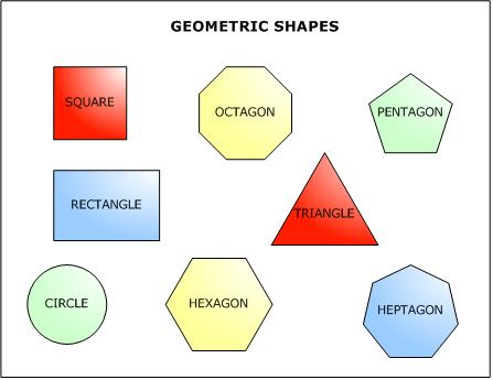
Shape- Shape is a two dimentional and is enclosed by lines. The shape may be a geometric with straight, edges and angles
Form- Form is a two dimentional and artists use form when shading to create the illusoin of form, to create depth you would shade.
http://www.c-sharpcorner.com/UploadFile/eecabral/OOPSand.NET211102005075520AM/Images/shapes.jpg (bottom)
http://www.artbywicks.com/world%20form%20passing%20away%20art.jpg(top)
By: Janice & Abby
Wednesday, October 15, 2008
Shape and Form
Rule of Thirds

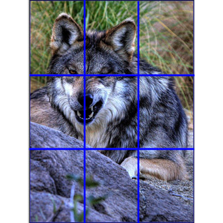
Rule of Thirds is the basics of photography. With the rule of thirds you brake down an image before and or after you take the photo. When you use the rule of thirds you simply brake down the picture into 3rds vertical and horizontal. This helps with placing your object so its no dead center in the frame. Its not necessarily a bad thing to place your fouces point in the middle but its nice to have a bit of verity.
http://www.allensphotoblog.com/blog1/images/WolfRuleThirds.jpg (bottom)
http://www.photography101.org/images/ruleofthirds.jpg(top)
http://digital-photography-school.com/blog/rule-of-thirds/
By:Abby & Janice
Tuesday, October 14, 2008
Glass of water
This is a claymation video from one of my favorite web video makers =)I recommend you check out his sight its www.knoxskorner.com OR if you go on youtube type in knox's korner and you will probably find some of his videos
Thursday, October 9, 2008
CyberARTS logo assignemnt

This is my cyber arts logo assignment. We had to create a company and a logo. I chose a peacock for my animal. I decided to use a peacock because peacocks are every colourful birds which reflect my personality. The peacock represents my company because when you think of a peacock the words that come to mind are graceful, proud,pretty, colourful and freedom. All those words that come to mind are what my company is all about. We will have beautiful colourful designs at your request. The design that you receive will be grace full and smooth.
The colours I choose for my coloured version were a light blue,light pink and a similar but darker shade of pink/purple. The colours i choose were cool toned colours. The light blue helps promote the feeling off calm,tranquility, understanding and & sophisticated.The light purple gives the immersion of royalty and sophistication. The purple/pink colour blends well with the purple. The colour also conveys the impression of power, nobility, luxury, and ambition power,nobility,luxury, and ambition. I decided to use black as a back drop because its helped make the peacock stand out. For the black and white My peacock is fully black with the eyes of the feathers outlined in black and the inside white. In both versions of the logo the feathers are long diagonal lines promote the feeling of poise, sophistication and strength.
Note: The second logo is not up due to difficulty's but will be up shortly
Wednesday, October 1, 2008

This is my 2nd art assighnment. We were asked to draw a chess peice with value and a background with movemet.
I ceated movement in the background by using lots of diagiol lines. The diagonal lines pull your eyes across the page. Theres a Larg cuved, almost ribin flowing lines. They move your eyes from the far left corner to the middle right half and then to the top left side.My chess peice was drawn from a eye level point of veiw. The light was reflecting off the right side twords the middle so in the drawning the least amount of shading was done there, then slowly begins to darken twords the sides.
Subscribe to:
Posts (Atom)

